

Day 1
The images is meant to present a feeling of new opportunities. A new day with exciting frontiers. I've used lines to direct the eye to the centre left and the viewer then works their way from the text 'An Image' to 'A Day' then lastly my name. Gradients have been used to give the image depth. I noticed without it, the image was quite boring and not easily understood.
Process:Using a reference image for colour picking I started grouping/seperating sections into key colours.
Process:Using a reference image for colour picking I started grouping/seperating sections into key colours.
Medium used: Adobe Photoshop
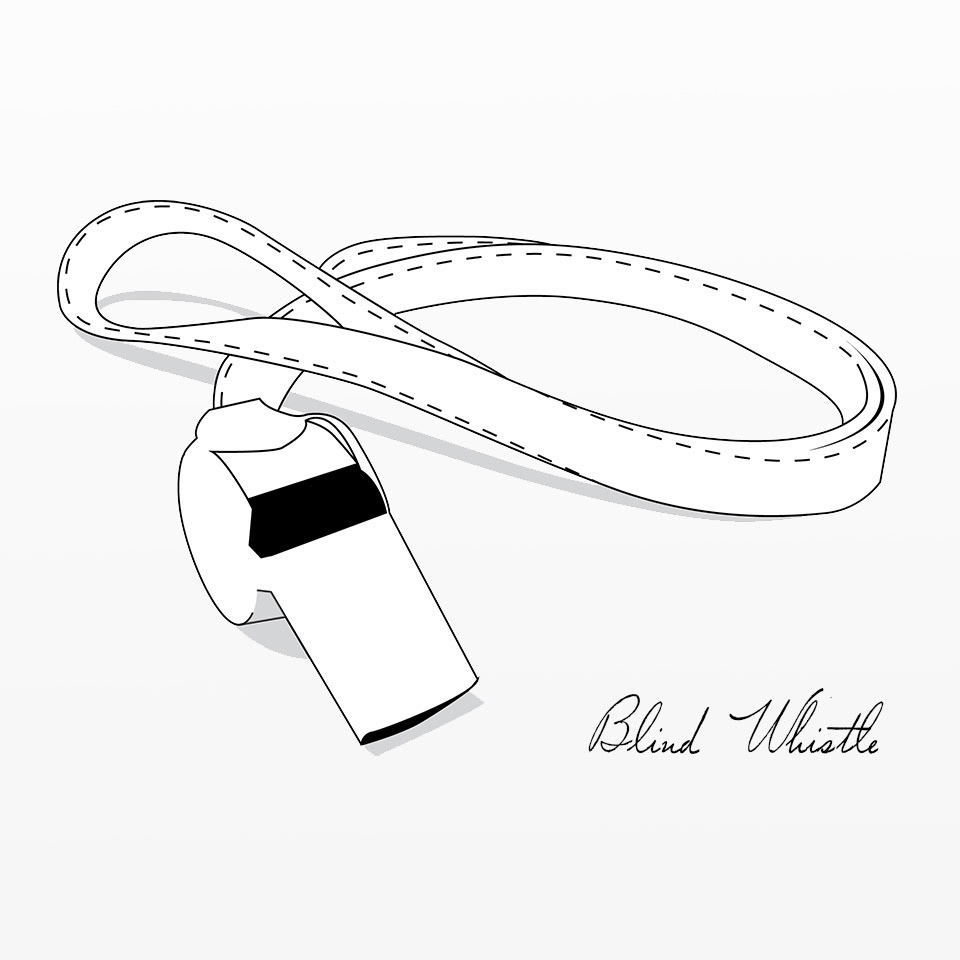
Day 2
Refereshing my Illustrator skills.
Used monotones to evoke the blind element and to 'comment' on how referrees are percieved. In this case blind. The message is brought across using the iconic tool they use (a whistle) and using a black fill which is intended to symbolise the eyes of the whistle. Thus creating a character. It's supposed to be a subtly humerous 'comment'.
Medium used: Adobe Illustrator
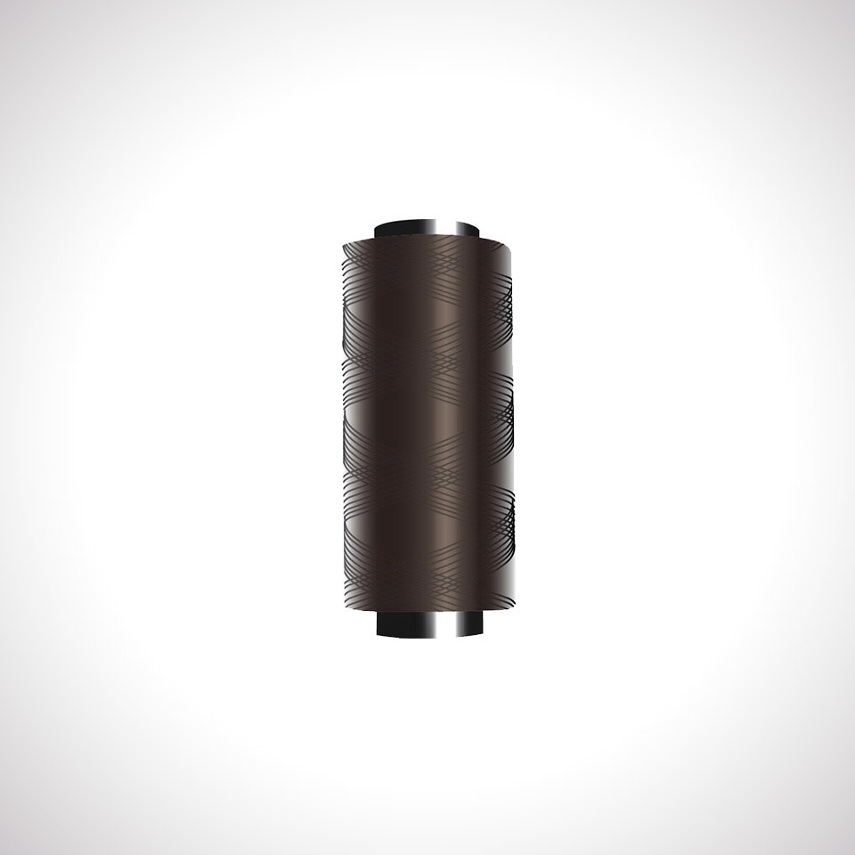
Day 3
I took an photo of a Thread Reel and tried to replicated it with as few processes as possible.
not as detailed as the real thing but it's looks very similar. Used the most visible thread pattern I saw in from my photo to hint it is thread using line weight to give it that impression. 4 layers used in total. Background done in photoshop. I guessed how the lighting would look with this background and lightsource.
Happy with this one.
Medium/media used: Adobe Illustrator
Medium/media used: Adobe Illustrator
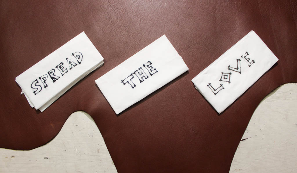
Day 4
Played around with some tissues and found how the ink bleeds on it interesting. When used at corner points it gives greater understanding of a corner. Tried to see how it would look as a font concept. Used Leather background to contrast the tissues. The message spread the love isn't as clear as I'd like. It's a comment/view on our love of consumer materials.
Medium/media used: Canon 500D + Flash
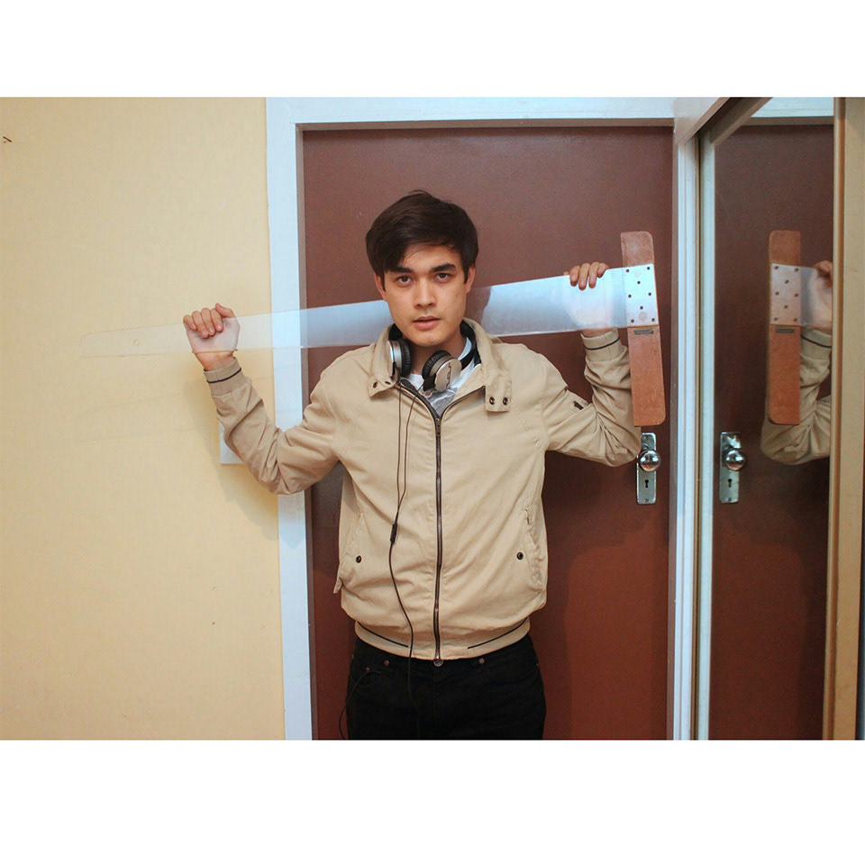
Day 5
Am I an Architect yet?
Took an Image of myself with a tsquare to emulate a student acting like he's an Architect. It's an Insight I wanted to portray through a photograph, how much about owning a title is mostly pretending you fit the part.
Am I an Architect yet?
Took an Image of myself with a tsquare to emulate a student acting like he's an Architect. It's an Insight I wanted to portray through a photograph, how much about owning a title is mostly pretending you fit the part.
Medium/media used: Canon 500D + Flash

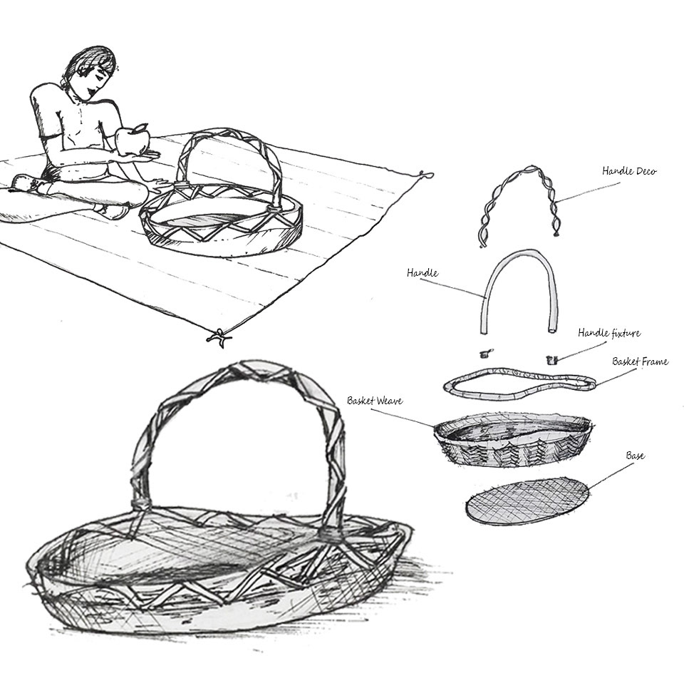
Day 6
Sketching Experimentation.
3 attempts. Each having their own sketching style and shading.
Post sketch I've taken a photo and removed a (grey) tone from the original image but for the basket to the right and below I left that tone in because It sort of makes the product :look more natural, attact the eye, softer on the eye. (less contrast that the top image)
Medium/media used: Adobe Photoshop + Fine liner + 2B pencil

Day 7
Rhino sketch using Simple 2D shapes to indicate 3D From.
I used a pencil sketch I drew of a rhino sculpture then I picked out the key forms and used geometric shapes to communicate it's form. Ie. circle for the knee, and large circle for the stomach.
I used a pencil sketch I drew of a rhino sculpture then I picked out the key forms and used geometric shapes to communicate it's form. Ie. circle for the knee, and large circle for the stomach.
Medium/media used: 1mm Fine Liner
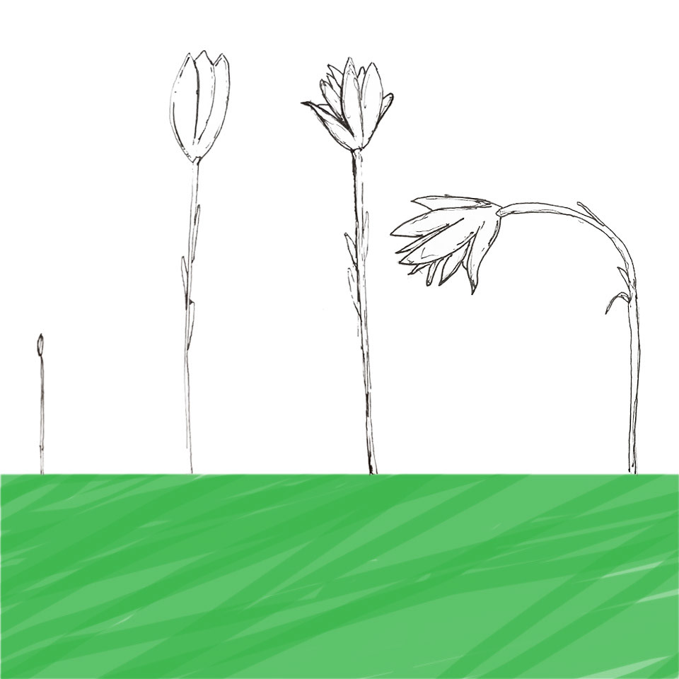
Day 8
Leaning towards a more scientific sketch showing the process of a growing tulip to a withering one.
Found it interesing that this side view with the unnatural looking green grass makes the tulip seem enormous. a familar for us to understand it's scale. ie. tennis ball, tree or person.
Leaning towards a more scientific sketch showing the process of a growing tulip to a withering one.
Found it interesing that this side view with the unnatural looking green grass makes the tulip seem enormous. a familar for us to understand it's scale. ie. tennis ball, tree or person.
Medium/media used: Adobe Photoshop + Fine Liner

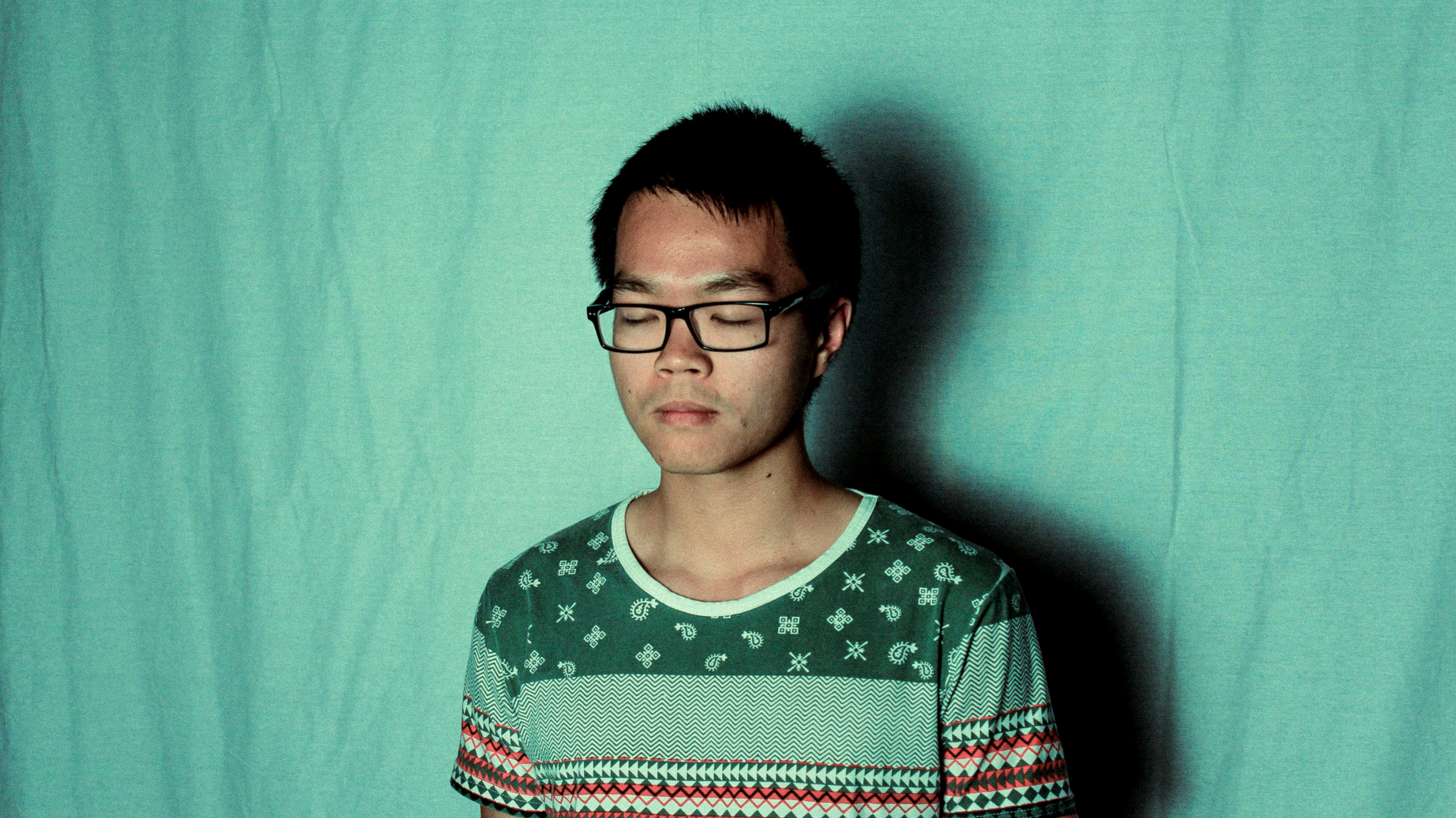
Day 9
Rhino owns
Rhino owns
Used abnormal colours as a form of wimsy with small details in different colours to draw attention to them.
With the shading I experimented with a combination of thin hatching and thick solid black. I found solid shading gives a harsh look and it's hard to understand the 3D shape. Think line hatching is much softer on the eyes and it's provide the information needed to understand curvature. The shadow under the Rhino seems disproportioned to the Rhino itself.
With the shading I experimented with a combination of thin hatching and thick solid black. I found solid shading gives a harsh look and it's hard to understand the 3D shape. Think line hatching is much softer on the eyes and it's provide the information needed to understand curvature. The shadow under the Rhino seems disproportioned to the Rhino itself.
Medium/Media used: Adobe Illustrator (Brush + Fill tool + wacom tablet )
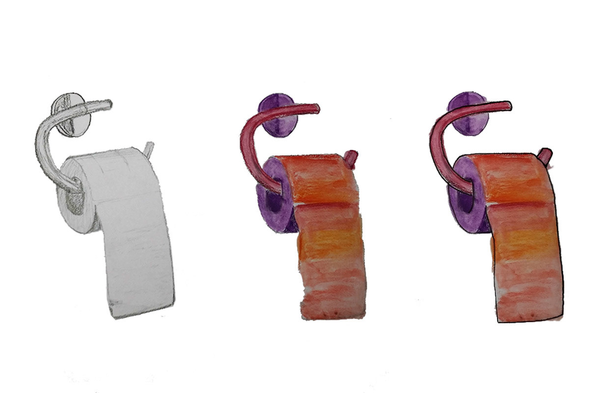
Day 10
Traditional TP
Traditional media Experimentation.
Medium /Media used:
1 Graphite pencil sketch.
1 Graphite pencil sketch.
2 Water colour.
2 Water colour combined with black fineliner outline.
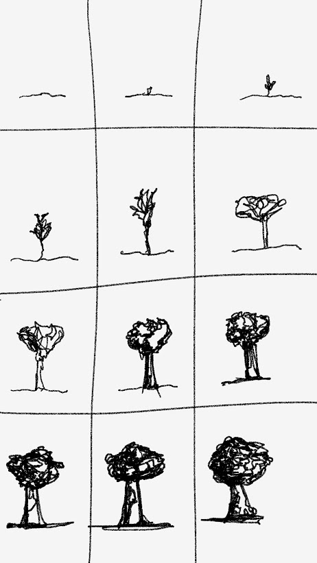
Day 12
Tree aging
Medium/media used: Samsung S Note app.
Day 13
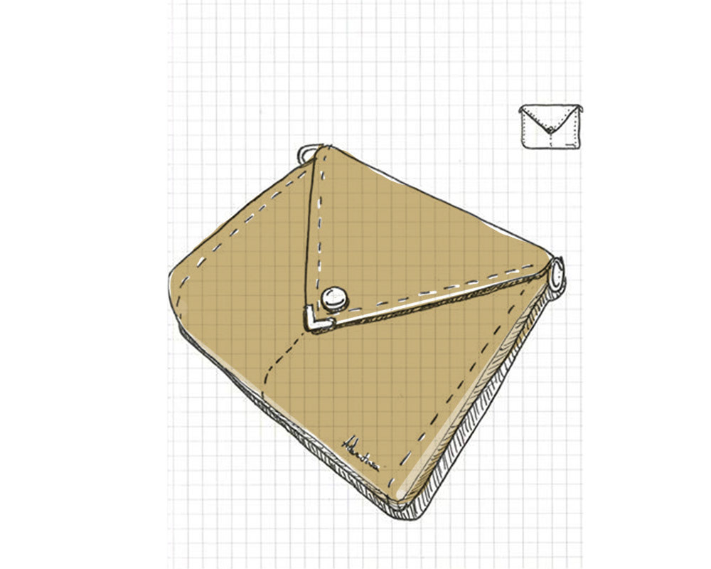
Bag Design

Day 14
bag design in a context

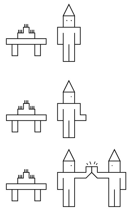
Day 15
Office Party
Office Party
Medium/media used: Adobe Illustrator (snap to grid)
Day 16
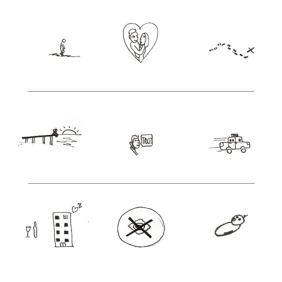
no condom= baby.
Story board. Fairly self explainatary.
no condom= baby.
Story board. Fairly self explainatary.
Medium/media used: Adobe Photoshop + Fine Liner
Day 17
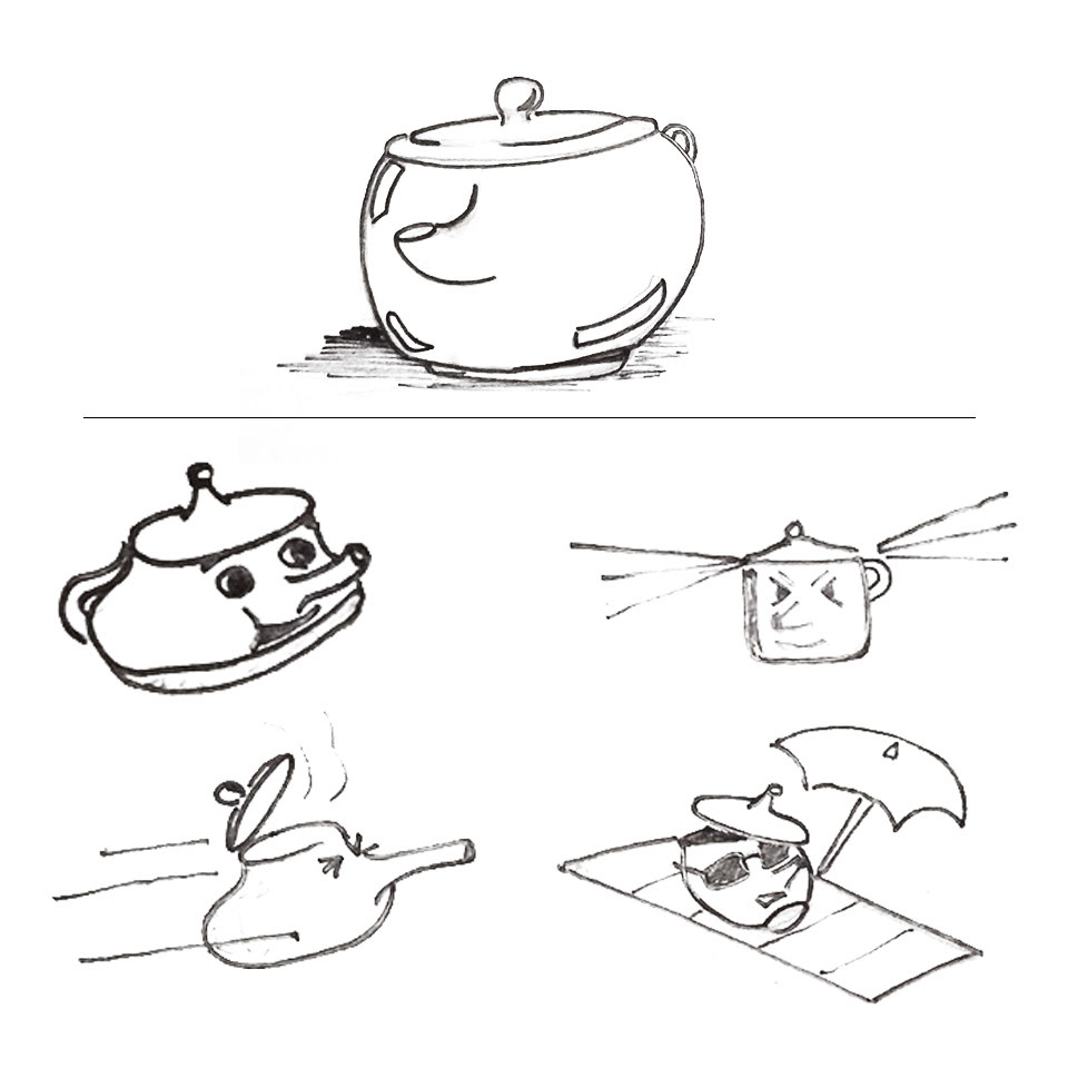
Tea Cup
Started off with a drawing of a tea cup from the top of my head. (top)
Activity task: draw the tea cup again with emotions/actions such as happy, angry, fast/in a hurry or relaxed.
Noticed when I tried to apply a 'human' emotion to a inanimate object it became cartoon like or surreal with different props and expressions used to give that product an emotion.
Medium/media used: Adobe Photoshop + Fine Liner
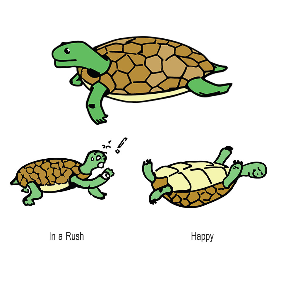
Day 18
Again, the drawing without a prompt for an emotion (top) turned out more scientific looking even though I was drawing this turtle from the top of my head with no reference.
Process: Line work drawing scanned and placed into illustrator. Added simple block colour scheme.
Process: Line work drawing scanned and placed into illustrator. Added simple block colour scheme.
Medium/media used: Adobe Illustrator
Day 19
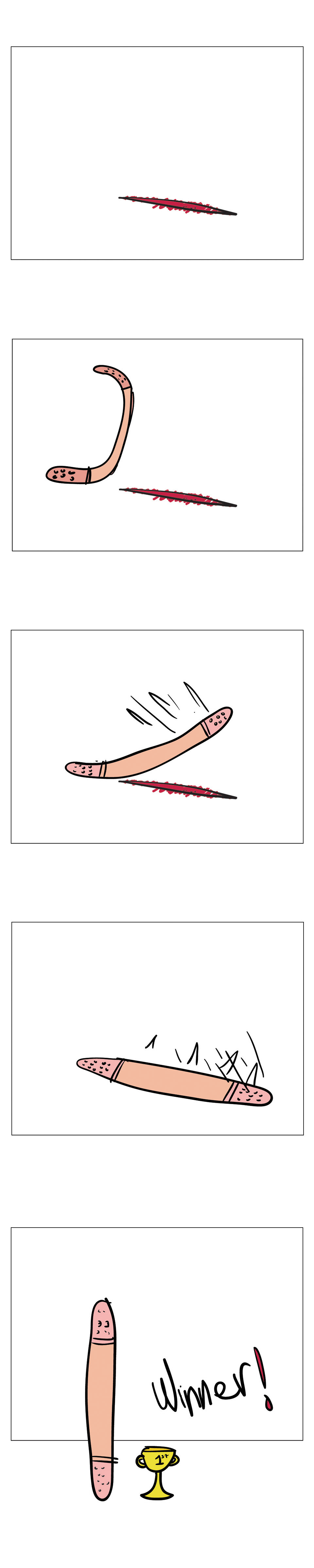
Band-Aid Smack Down!
A sequence of events that shows the story of a successful Band-Aid.
Child like drawing give the story a light hearted feel about it.
Meduim used. Adobe Illustrator: brush tool + colour blocking.
Band-Aid Smack Down!
A sequence of events that shows the story of a successful Band-Aid.
Child like drawing give the story a light hearted feel about it.
Meduim used. Adobe Illustrator: brush tool + colour blocking.

Day 20
Visual representation of Mac Donalds Delivery service news.
Visual representation of Mac Donalds Delivery service news.
Medium/media used: Adobe Illustrator
Day 21
Using a techniques where you don't lift the pen off paper to draw an image. In this case I drew a story.
Experimented with screen and overlay filters.
Using a techniques where you don't lift the pen off paper to draw an image. In this case I drew a story.
Experimented with screen and overlay filters.
Medium/media used: Adobe Photoshop + Fine Liner

Day 22
Red bowtie and blue hat guy


Day 23
It's not really comfortable.
Medium/media used: Adobe Illustrator

Day 24
Illustration of different people using line weight and sketching technique to present different mood types.
1. Light hearted lady
2.Unknown dangerous man
3. Thumbs up guy
Each Objective
1.Find feature of the face when happy using seemingly haphazard linework but adding linework for individual key shapes. Finding highpoints and crevasse. Using this knowledge curves were placed in those areas. Freehand makes it look like this was created in a relaxed environment which translates enhances the mood presented.
2. Back and forth shading to make a silhouette with no distinguishable features to give a unknown element to the character. Where 2 lots of shading meet was used deliberately to indicate the part of an arm. Shoulders and large torso indicates it’s a man.
3. Thickness to show boldness of character with endearing smile. Posture indicates a boy ready to get to action. Read to go do something. Squiggles used of the hair to show how the hair parts.
Medium/media used: Samsung S note App.

Day 25
What does the world do when it's stressed out?
Medium/media used: Samsung S note App (pencil tool)
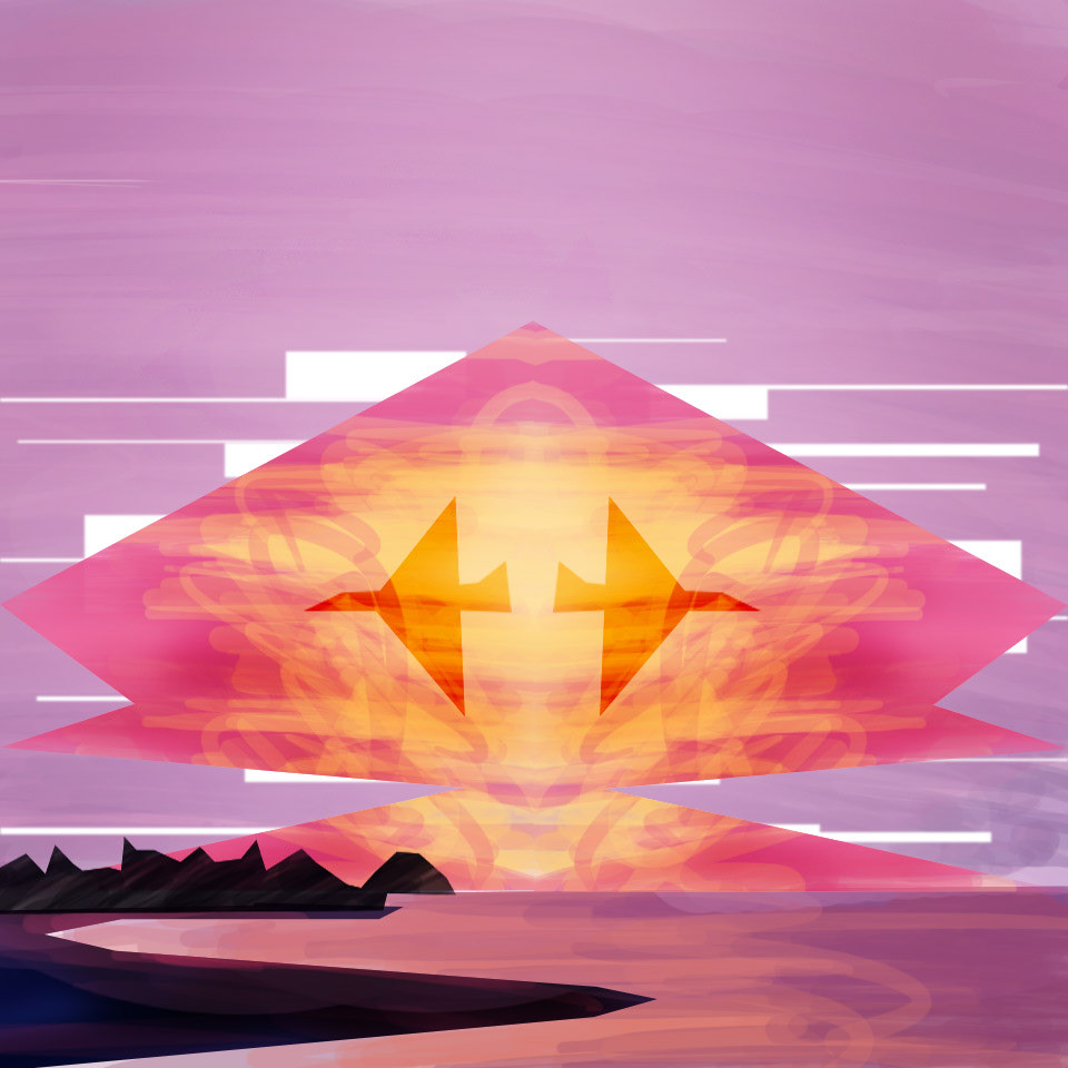
Day 26
Hiroshima
refreshing my Photoshop/digital painting skills.
The centre shape is the focus which is my interpreted shape of the Hiroshima atom bomb explosion. Hiroshima is near a coast line and I've added an indication of that.
Used symmetry to create a face with planes as eyes. Tried to use dodge and burn effect to give the atom bomb depth. Abstract use of white to emulate clouds.
Medium/media used: Adobe Photoshop
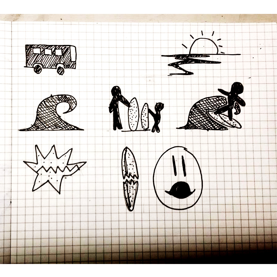
Day 27
Experimentation with hatching techniques has been used to disinguish different objects. Sihouette shapes of objects has been used for ease of understanding.
Increased the contrast and if gave a seipa look. These events happened in the past and I think it works to protray that.
Story: Father and child travel to the seaside on a bus. They surf however one crash and the boys surfboard breaks. ( Should have made it clearer which individual was surfing that now has a broken board)
Medium/media used: Adobe Photoshop + Fine Liner

Day 28
The new Era of propersity lies with China. I show this using the old stereotypicial conical hat on a man with a smart phone device next to a hydroponic farm. The conical hat is the symbol of a field work/labour but now it seems obselete in this context.
Medium/media used: Adobe Photoshop + Fine Liner
Day 29

Day 30 + 31
It all makes sense now.
It all makes sense now.
Medium/media used: (original sketch, place into Adobe Illustrator and use Silhouette trace)
Day 32
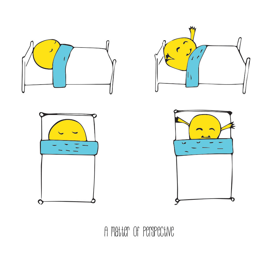
A new day
Experimenting with perspectives and perception of elements like the sun in a human context. The sun is rising out of bed but from a top view seems very similar to the sunrising from the ocean horizon.
The bed has been redrawn in all instances to show subtle differences, which reenforces the concept written at the bottom of the image,'A matter of perspective'.
Started with sketches. Placed into illustrator. Image traced linework. Merged a background, ungrouped then colour picked for closed off sections.
Medium/media used: Adobe Illustrator

Day 33
Had a go at hand lettering to see how I would be able to direct the eye to key words of importance.
I find it interesting how text in this sense can be given character in a novel situation. LIke the word 'CARRY' carrying the weight of the words above it. Anyway this was fun.
Inspired by Craft and Graphic designer Maureen of
http://www.madebymarzipan.com/?tutorial=intro-to-hand-lettering
"Minor flaws can add charm and interest to the piece"
Medium/media used: Fine Liner + Adobe Photoshop
Day 34
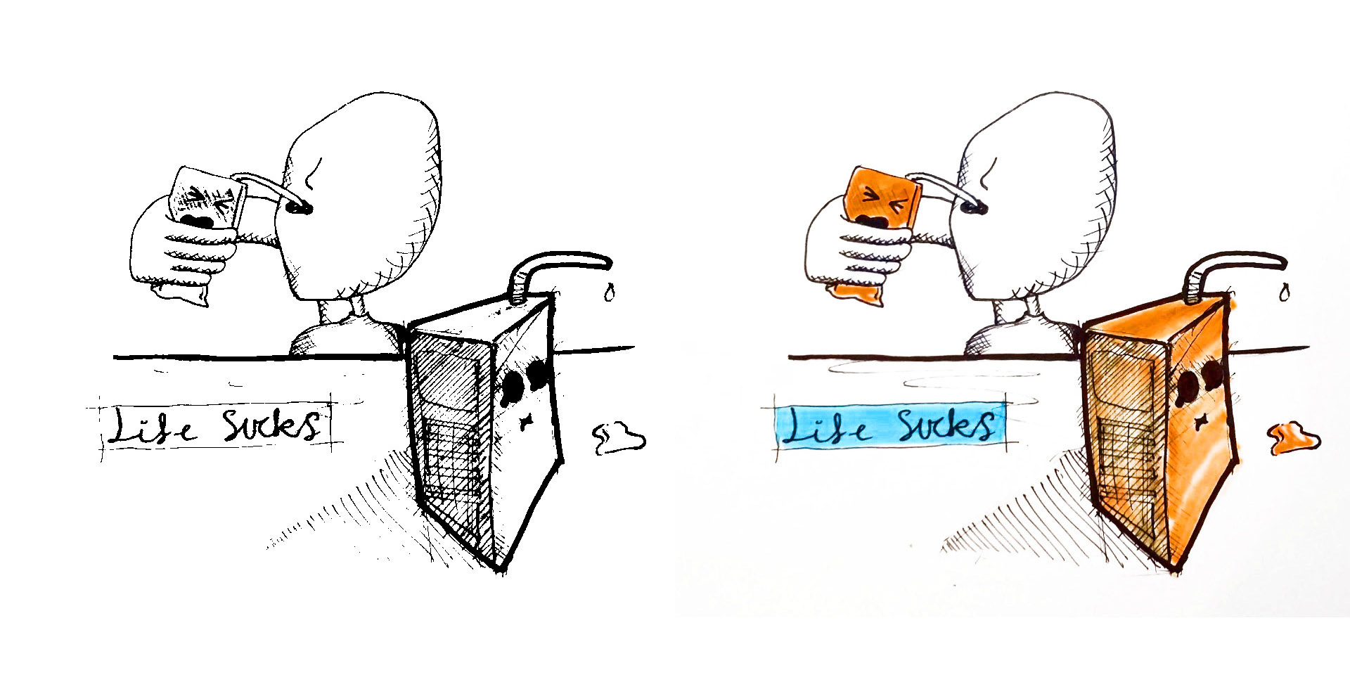
Life sucks in colour too.
Using hatching to give objects shading, whilst also reenforces the emotion of the popper. In manga this is usually used to show depression or a imaginary vail of denail or embarrassment.
Medium/media used: Adobe Photoshop + Fine Liner + Highlighter


Day 35 + 36
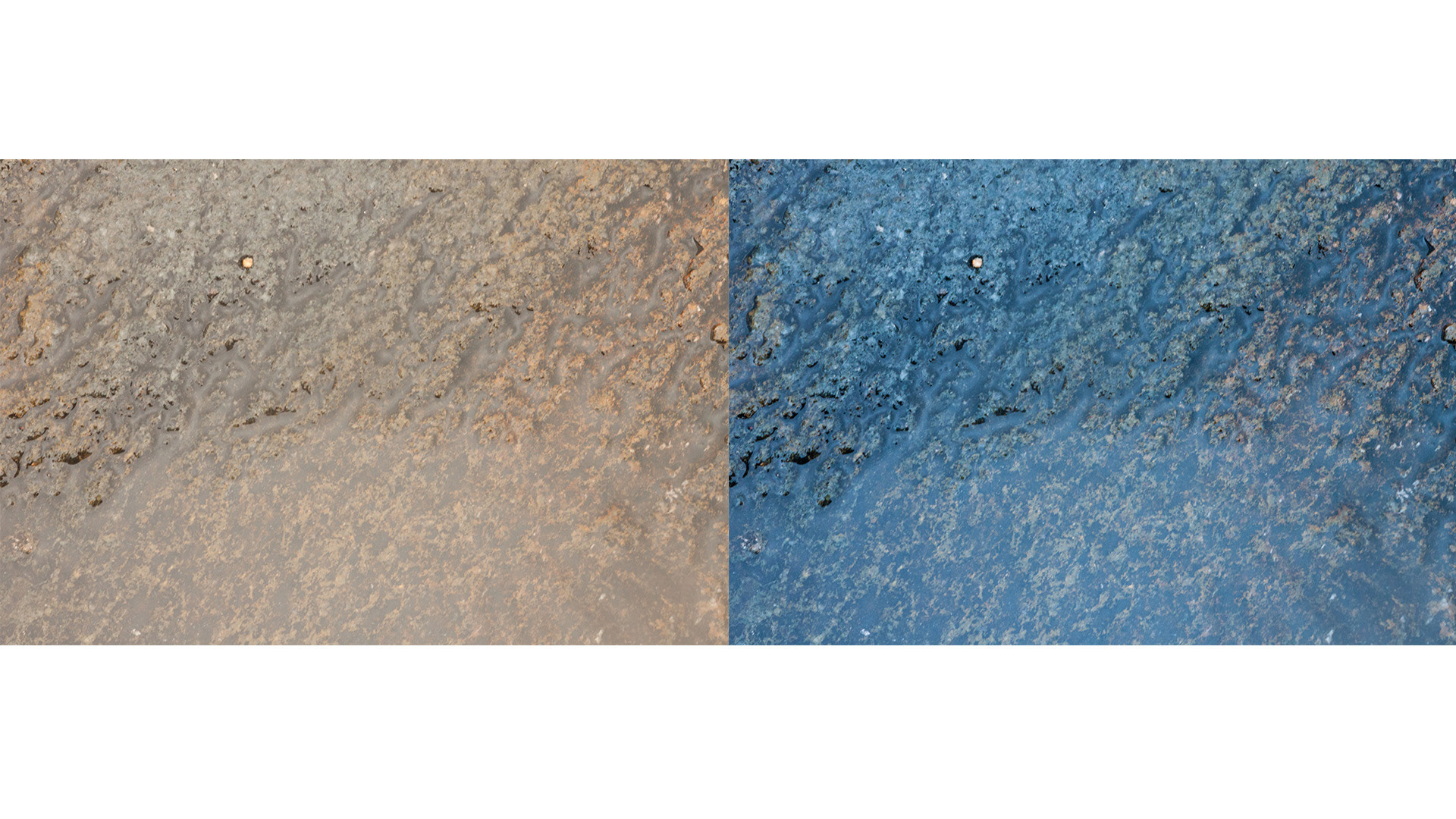
Before and After Photography editing using Adobe Bridge.
Before and After Photography editing using Adobe Bridge.
These photographs show how RAW images can be enhanced using a various setting changes.
Images can be changes to give warm or a cold appearance. Also highlights, blacks and whites can be increased or decreased to change the constrast and intensity of the image.
Images can be changes to give warm or a cold appearance. Also highlights, blacks and whites can be increased or decreased to change the constrast and intensity of the image.
Medium/media used: Canon 500D + 55-255 mm length lens + Adobe Bridge

Day 37 + 38
Caterpillars and leaves
Experimenting with Illustration and Photo combination
Tools: Adobe Photoshop + Illustrator
Note all pairs of eyes are the same repeatition. However using different positioning either in front or behind, raised or lowered makes the characters seem like they have a different expression.
I was inspired by the graphic artists Johan Thörnqvist of http://www.snarlik.se/ .He uses illustrator to places illustrated characters and environments into a photos. Each illustration blends in with the image to create a new context or fantasy.
Medium/media used: Canon 500D + 50 mm length lens + Adobe Bridge + Illustrator (catepillars) + Photoshop
Day 39
Sustainability and Technology
Medium/media used: Canon 500D + 50mm length lens + Adobe Bridge + Photoshop
Day 40
F/5.6
1/100
ISO 100
In this instance I have used a larger apeture which means I can have a low Iso. I wanted to do this because it is effective when creating blurred, out of focus elements whilst keeping high detail on the focal point. This could have been lost if the iso was increased because grain increases with higher ISO settings
In this instance I have used a larger apeture which means I can have a low Iso. I wanted to do this because it is effective when creating blurred, out of focus elements whilst keeping high detail on the focal point. This could have been lost if the iso was increased because grain increases with higher ISO settings
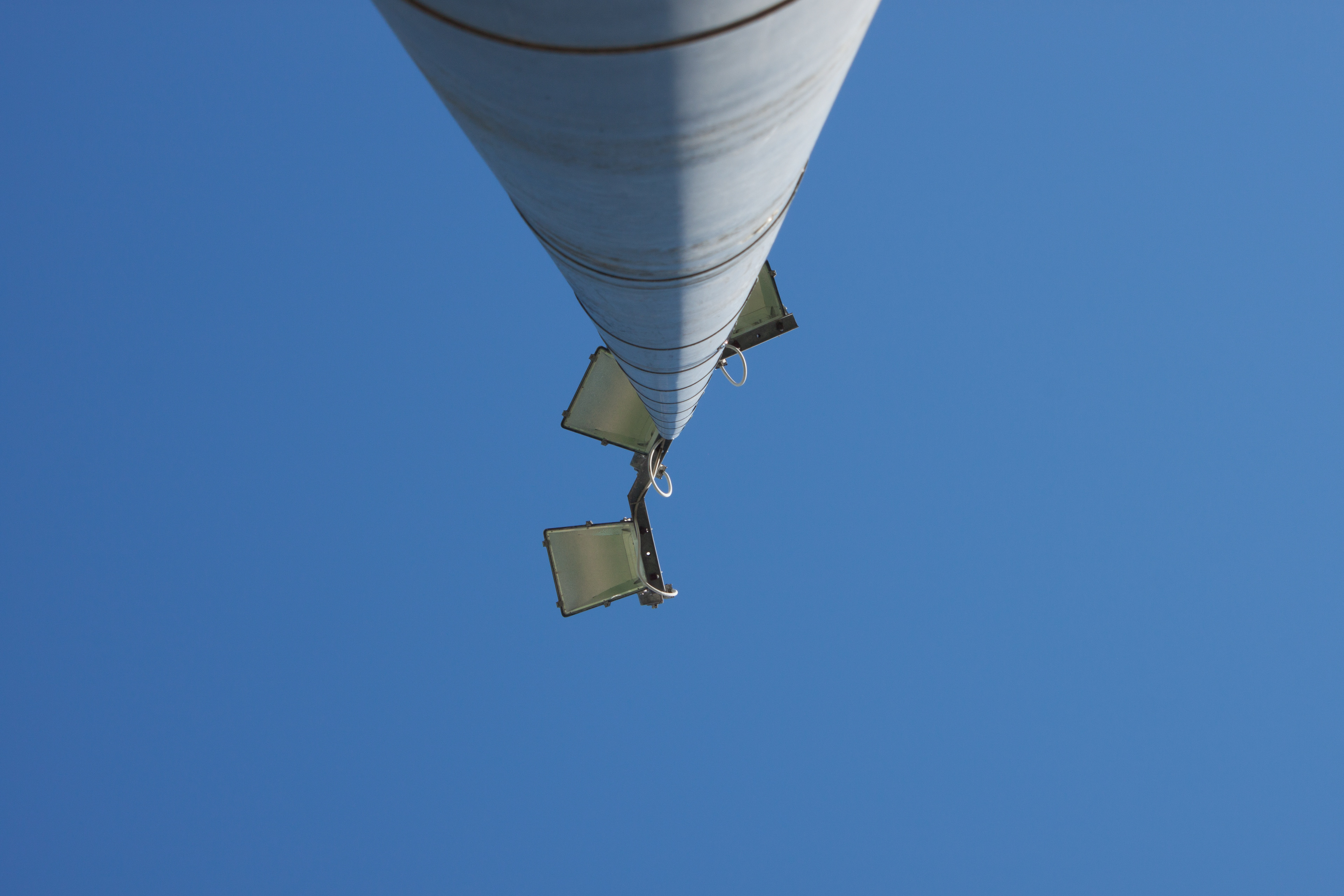
Day 41
Split Lighting using the sun.
I thought it would be interesting to create symmetry using light and shadow.
The split light divide the pole into two halves. I have also made sure my camera points directly to the centre of the converging perspective.
I'm not sure if it's an illusion created from the shadow but it seems that there is more pole distributed to the left.


Day 42
Photoshop Tree + Person cut out
The lens flare over both the person and the tree trunk makes the illusion more intriguing.
The lens flare over both the person and the tree trunk makes the illusion more intriguing.
Medium/media used: Canon 500D

Day 43
The warm tunnel
The warm tunnel
I wanted to make a tunnel have a warm and inviting feel unlike the
general persception it is a cold, dark and dirty place.
To do this I used Adobe lightroom to edit the photo settings. I increase contrast and warm temp giving it a yellow tint. I reduced shadows so the view can see detail in the dark areas meaning there is less to be afraid of. Also as a note the light hitting the ground makes a smile- the two tunnels are the eyes and the beam above is the eyebrow. :) This makes the image seem like a happy environment without the viewer knowing why immediately.
To do this I used Adobe lightroom to edit the photo settings. I increase contrast and warm temp giving it a yellow tint. I reduced shadows so the view can see detail in the dark areas meaning there is less to be afraid of. Also as a note the light hitting the ground makes a smile- the two tunnels are the eyes and the beam above is the eyebrow. :) This makes the image seem like a happy environment without the viewer knowing why immediately.
Medium/media used: Canon 500D
Day 44
Experimenting with patterns created from a photograph.
In this image I highlight the repetition of the same coloured leaves to create a somewhat even pattern.
I've used symmetry to evenly distribute the leaves to create and interesting texture.
In this image I highlight the repetition of the same coloured leaves to create a somewhat even pattern.
I've used symmetry to evenly distribute the leaves to create and interesting texture.
Iso is fairly low because I'm facing towards the sun. Focal length is short because I wanted close details of the leaves.
Camera settings
F/10.
F/10.
1/250
200 Iso
Medium/media used: Canon 500D + 50mm Length Lens + Adobe Bridge
Day 45
Using the hue tool
Day 46
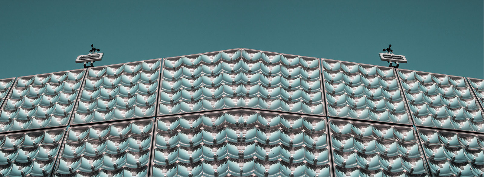
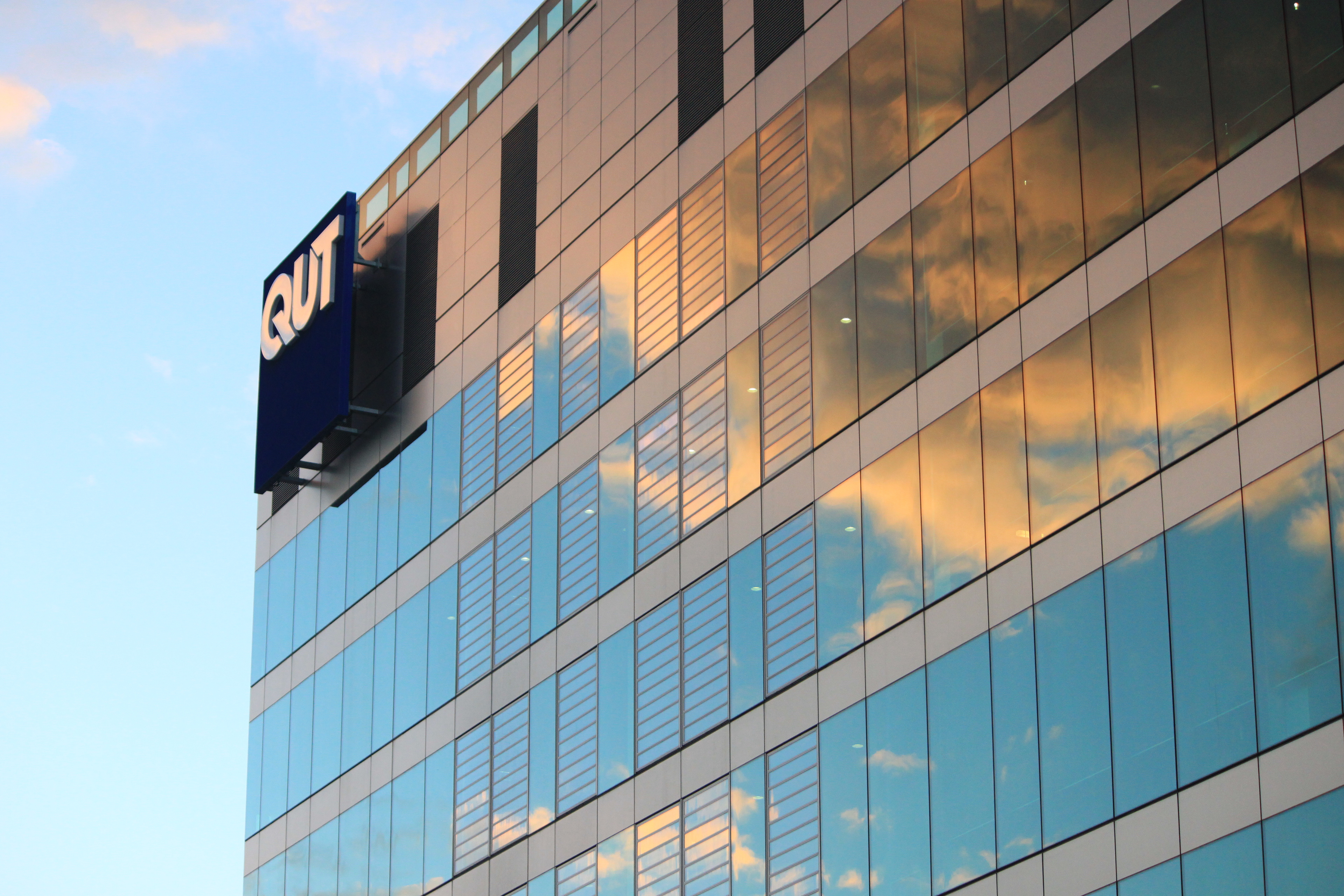
QUT
Reflection can give the viewer a different perspective on a building. Often Architects used glazed glass to bring reflections of nature onto the space. Lets be honest, nature looks more beautiful than most human designs. Also doing this can make the building disappear into it's environment giving the feeling like the building hasn't used a lot of materials and is more sustainable. It brings in the concept of nature where there isn't really one and attributes it to the building. In this case I've taken a worms eye view of the QUT P block building. The blue sky and perspective makes the building look like it's very big. Clouds can hold the concept of idea creation. Thus QUT in this image is presented as an idea creator.
Medium/media used: Canon 500D (no edit)
Medium/media used: Canon 500D (no edit)
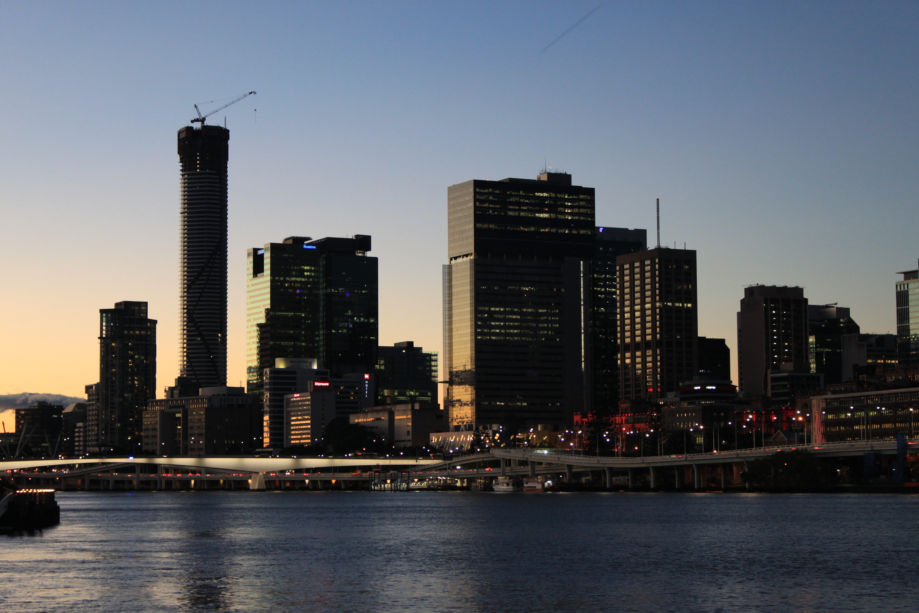
Day 47
Sunset city
The Time is 5:30 and I wanted to take photos because the golden hour is awesome. At this hour Warm light from the sun is diffused along the horizon which created a graded colour from yellow to blue sky which ads intrigue to the image. The sunset causes a harsh shadow on the right side of the buildings. This is fine because the colour both reflects the time frame and actions within the city. People are leaving and it's close to closing time of a lot of businesses in the city.
Medium/media used: Canon 500D + 55mm- 255mm lens + Adobe lightroom.
Medium/media used: Canon 500D + 55mm- 255mm lens + Adobe lightroom.


Day 48
Use of Day44 image and editing techniques to make abstract images. This image has an symetrical curve at the top so I thought It would be interesting if I could create duplicates and rotate them so it creates a circle.
1.using 8 duplicates of one image I created an interesting pattern. Multiple is used to allow layers to blend together meaning image edges are less defined and the image seems like one as a whole.
2.Experimentation with Photoshop effects such as linear burn, dissolve, subtract, multiply and darken
3. Hue changes using a photoshop Hue tool to create a colourful GIF image
Medium/media used: Adobe photoshop
Medium/media used: Adobe photoshop

Day 49
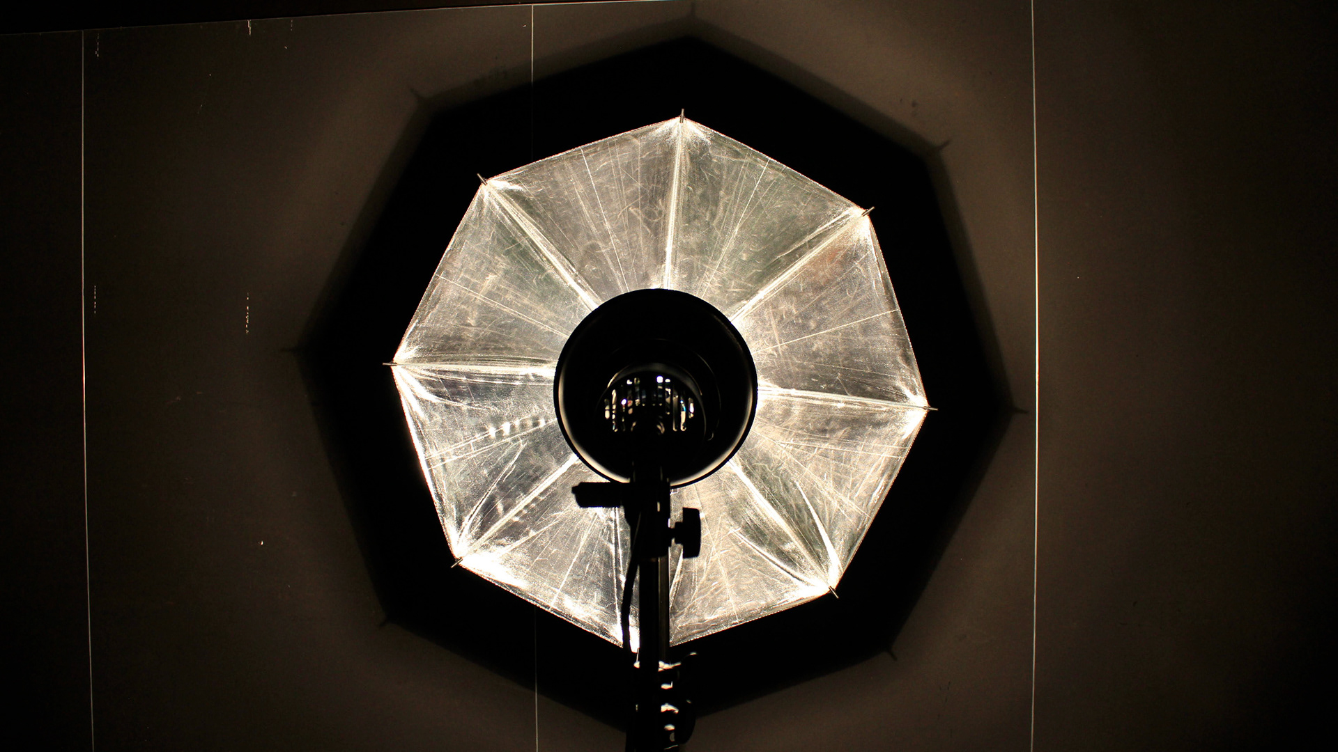
The hole in the moon.
I wanted to create a space like feeling with this image. The used of the reflective material of the umbrella. The reflective material has many scratch and pull marks in it's apperance that
I wanted the image to have a white and black feeling like the colours of the night sky and the moon. So I've desaturated the yellows and increased whites, blacks and shadows in order to take away the light that has fallen onto the wall.
I wanted the image to have a white and black feeling like the colours of the night sky and the moon. So I've desaturated the yellows and increased whites, blacks and shadows in order to take away the light that has fallen onto the wall.
The verticle metal pieces on the wall look like shooting stars further increasing the feeling that this is in space. I would have prefered to have some still metalic pieces to create distant stars. I could have used photoshop to place them in.
Medium/media used: Adobe bridge. Reflective light defuser and tungsten spot light.
Day 50
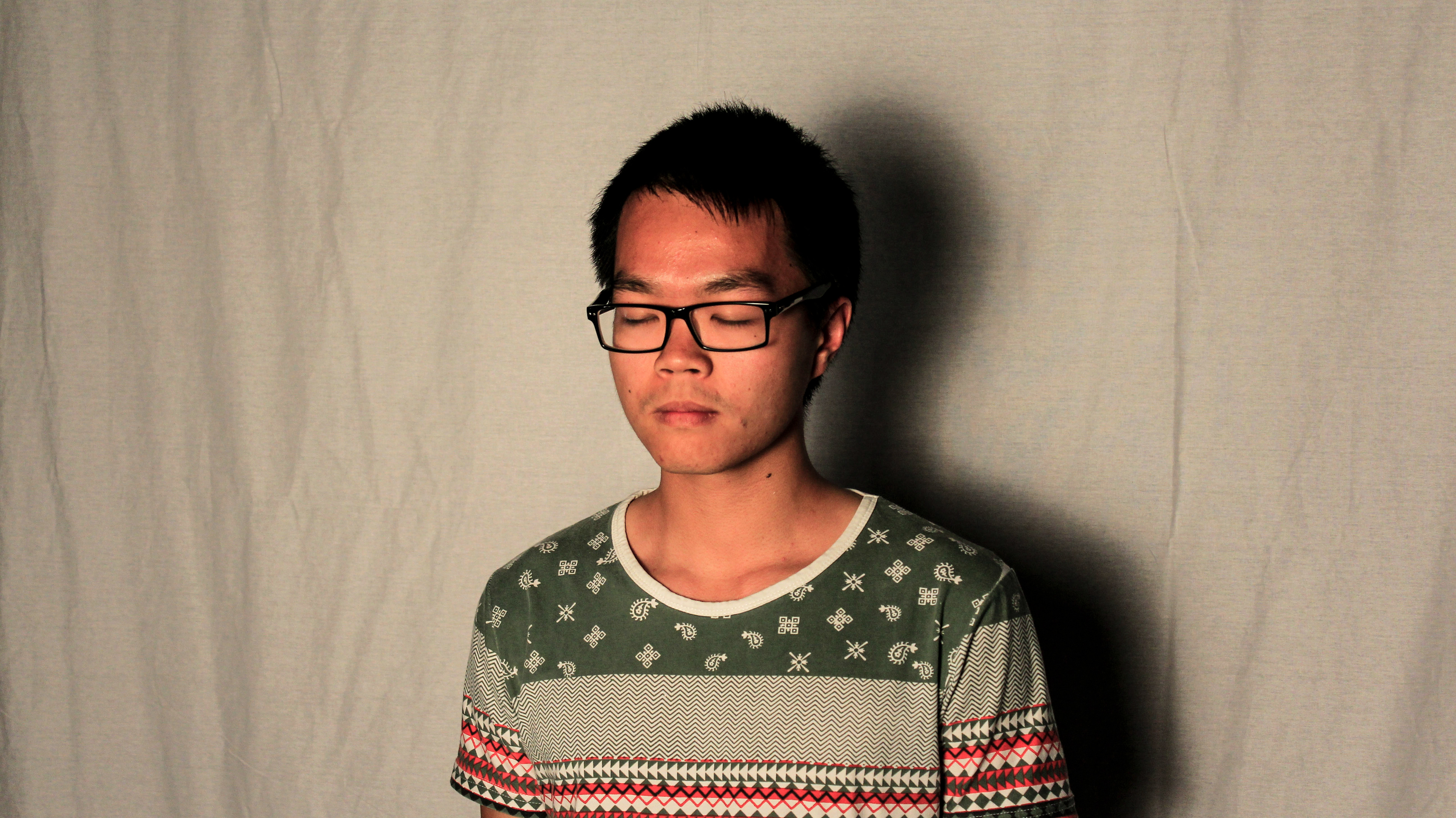
Dormant sickness
Here I've changed the hue of the image to green and increased the saturation a bit I've also increase the grain to create an un natural and a calm yet sickly look.
This has used a soft box and eye level which means the shows created are proportional to the subject. It created an interesting drop shadow. As if someone is lurking behind him. Maybe it can be used to symbolize sickness itself.
Medium/media used: Adobe Bridge
Day 51
Split lighting
I used Adobe bridge to increase the blacks and darken the shadows to increase the intensity of the split.
This technique can make the subject looked two faced, as if one side is of his personality is kind and the other dark and mysterious.
Medium/media used:
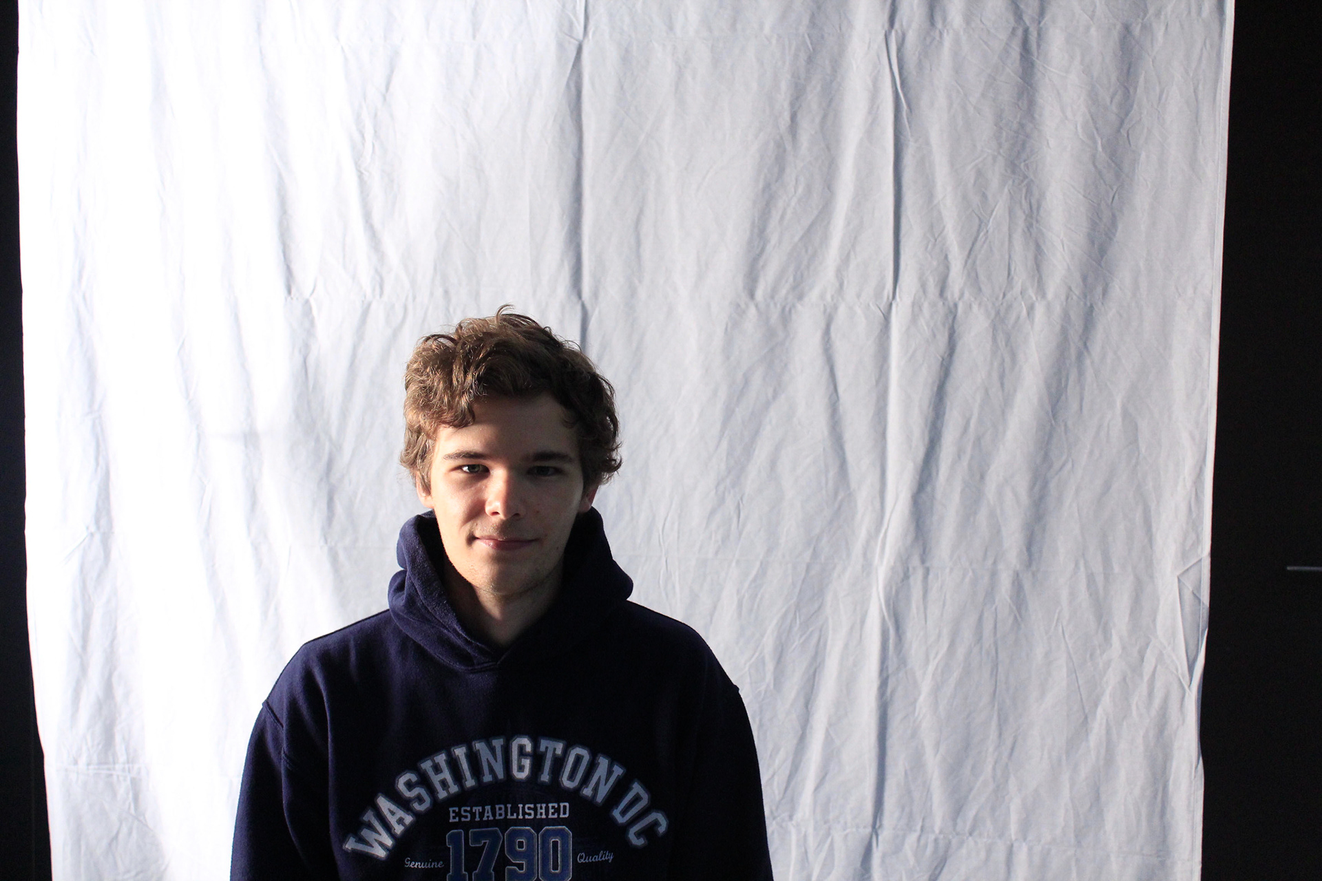
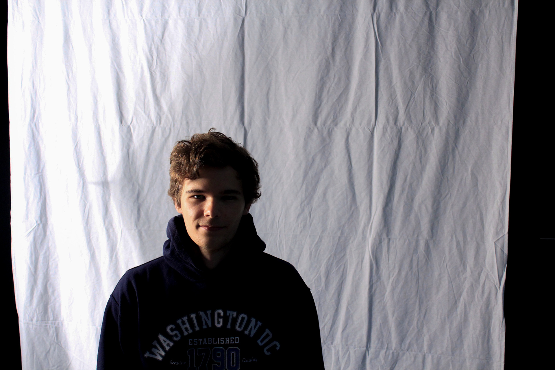
Day 52
Shy
Use of adobe bridge and a high stand for the spot light (this is called a butterfly lighting effect). However because the subject isn't facing directly towards the camera you can't see how the effect truly works. This lighting technique is very flattering because it lights up most of the face with a littlle triangle shadow under the nose. It also cases a little shadow under the chin. It is usually used for beauty shots. Also you'll notice there is little to no shadow cast onto the back sheet. I've used adobe bridge camera raw to create a warm tone to blend the colours of his hair with the surrounding environment. Fairly happy with it.
Medium/media used: Soft Box + Canon SLR +
Day 53
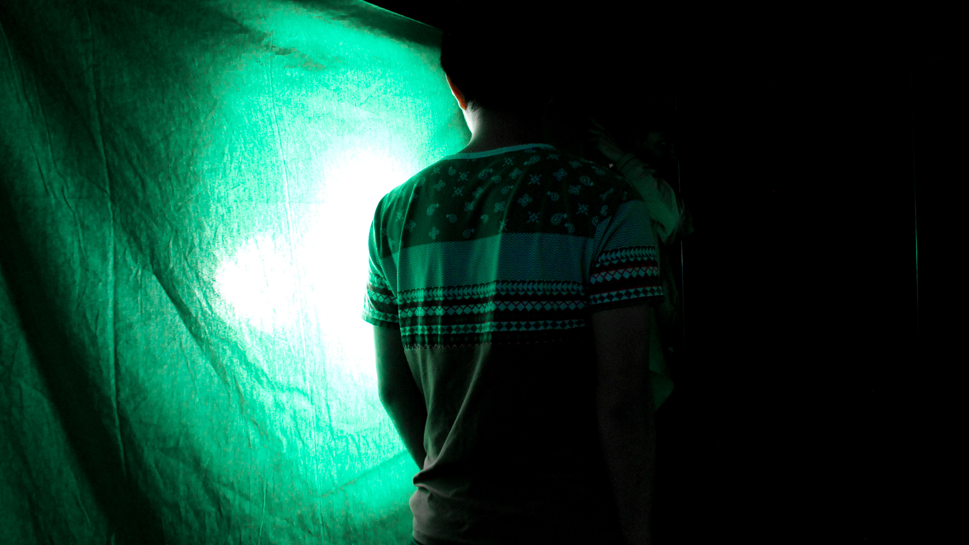
Coloured Lighting.
Using a thin green cotton fabric a green tinge can be created. The intensity of the light allowed for both white and green light to pass onto the subject. This created a cool effect. The angle the camera is taking the subject makes the over exposed sheet the backdrop and this means there is a strong contrast between the subject and the back sheet. It sort of has a split lighting effect but not quite because of the postion of the subject.
Medium/media used: Green fabric + tungsten spot light + Canon SLR
Day 54
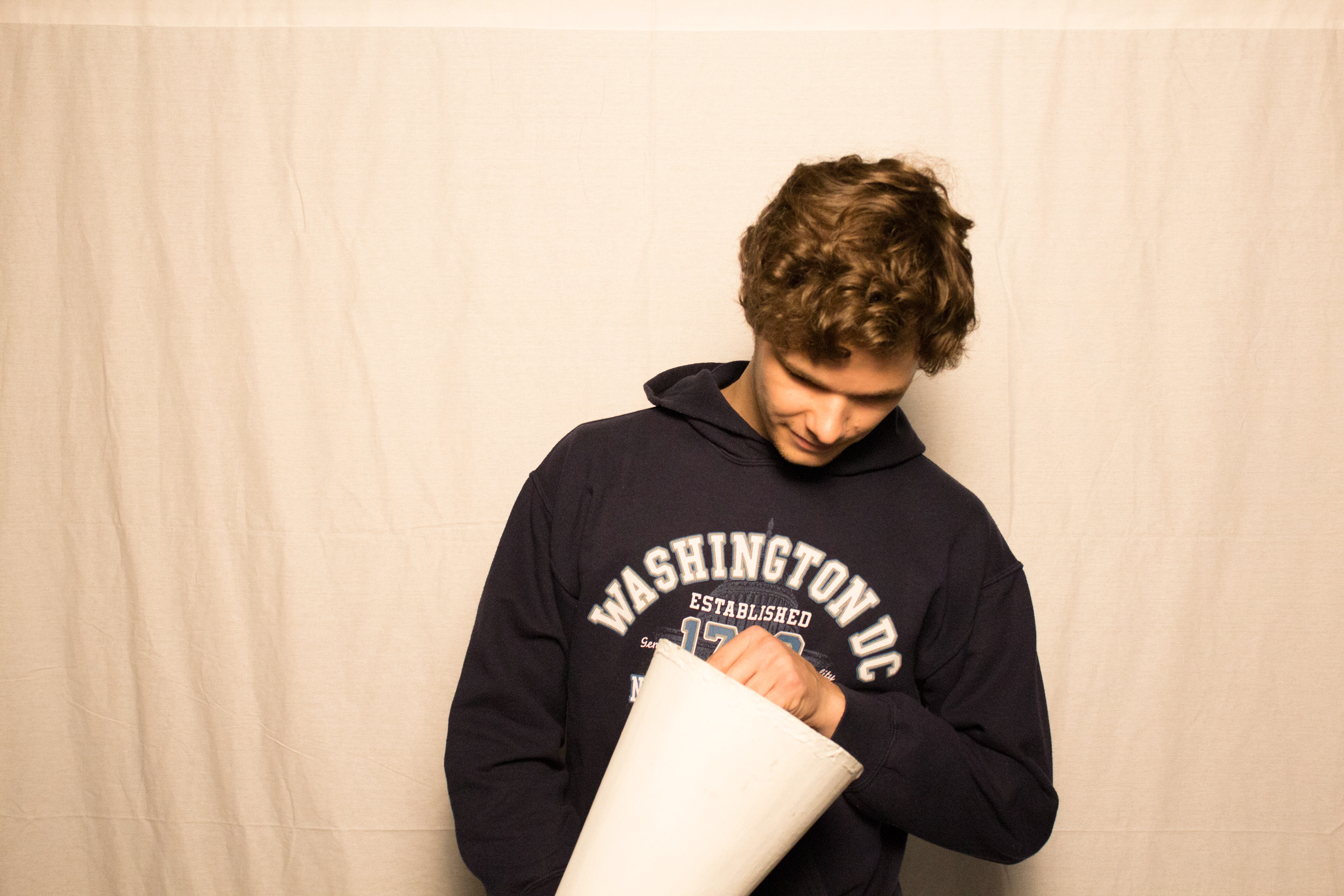
Eye-ception
Playing with focal length and focus.
With the focus manually focused on the eye, the eye is clearer than the out of focus cone.
With the focus manually focused on the eye, the eye is clearer than the out of focus cone.
The cone shape also created a visual vocal point demanding attention from the viewer. It kind of looks like an eye within an eye.
Medium/media used:

Day 55
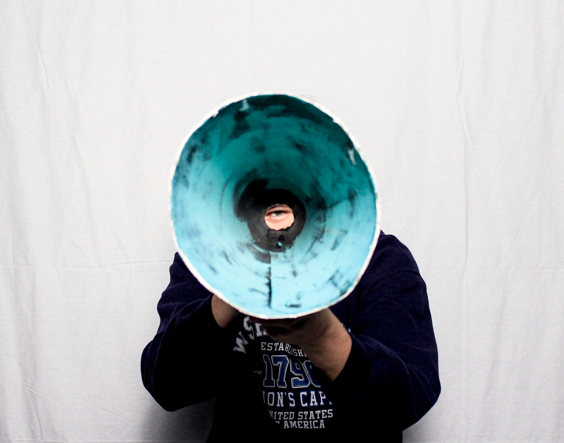
Here I've used 5 time lapsed images
Image 1: Cool tint value (- 40)
Image 1: Cool tint value (- 40)
image 2Cool tint value (-20)
Image 3: Tint value (0)
Image 4: tint value (+20)
Image 5: Warm tint value (+40)
I've done this to show that colour can enphasize an action and with it a certain mood can be shown.
When speaking into the cone the warm tone indicates noise production, whereas the cool tones indicate noise production is low.
10 images total. First 5 repeated in reverse to make a fluild back and forth motion.
When speaking into the cone the warm tone indicates noise production, whereas the cool tones indicate noise production is low.
10 images total. First 5 repeated in reverse to make a fluild back and forth motion.
Medium/media used: Adobe Bridge + Photoshop (motion/ gif)
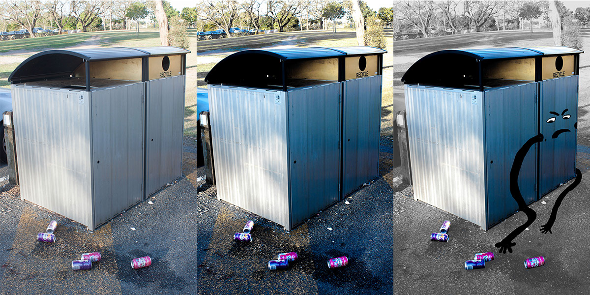
Day 56 + 57
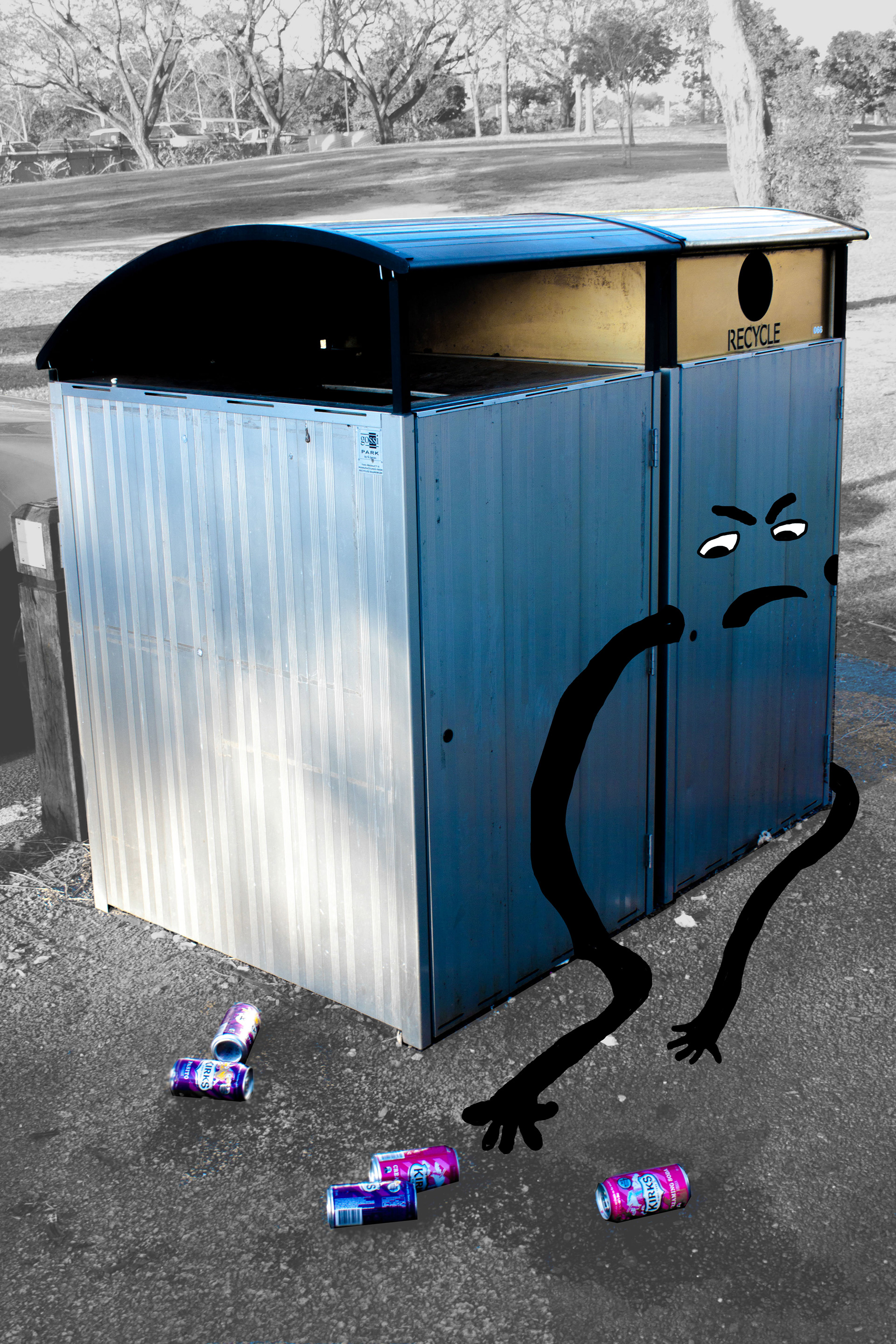
Recycling is just an arm’s length away!
When taking this photo I was think of the ways it could be used in a recycling campaign.
The image of cans on the ground next to the recycle bin as a provocative message. I wanted the viewer to feel disgust at how lazy people can be in regard to recycling.
Subject focus
When taking this photo I was think of the ways it could be used in a recycling campaign.
The image of cans on the ground next to the recycle bin as a provocative message. I wanted the viewer to feel disgust at how lazy people can be in regard to recycling.
Subject focus
1- Recycle bin
2- Cans on ground
3- Disapproval
The illustration gives the recycling bin a human emotion of discontent. This causes feelings of empathy in the viewer for an inanimate object because emotions are relatable to people. I have desaturated the colours around the key subjects because I want the message to be clear without visual clutter. Visual clutter is unnessary information that distracts from the core message.
The illustration gives the recycling bin a human emotion of discontent. This causes feelings of empathy in the viewer for an inanimate object because emotions are relatable to people. I have desaturated the colours around the key subjects because I want the message to be clear without visual clutter. Visual clutter is unnessary information that distracts from the core message.
Medium/media used: Canon 500D (50mm lens) +Adobe Photoshop + Bridge

Day 57
Father and Son.
Shows emotions of how each other feels about each other. Pride and a hint of cheeky intent.
I've used a stand and a flash that is pointing to a white ceiling. The light bounces from the ceiling and back down onto the subjects creating the illusion of butterfly lighting effect in a studio (without a soft box)
Using reflected light from a flash is much more flattering and less harsh. This means highlights aren't blown out and even colour gradients on the form are kept. This is a cropped image because the emotions shown on the face are the main focus. The different clothing shows a taste different but both understand each other. Black and White photography gives the image a timeless feeling like it's something of the past. An image that was worth keeping from a past era.
Inspiration: The famous Black and White portrait work of Yousuf Karsh, although his work has stronger light from above and the shadows are more distinct. He has taken many photographs of famous people and using lighting and shadow he depicts their personality. For instance his shot of Muhummad Ali, the light illuminates most of his face showing us this man is not afraid of us, with slight shadow under the brow to show he's serious. http://www.karsh.org/#/the_work/portraits/muhammad_ali
Medium/media used: Canon 500D
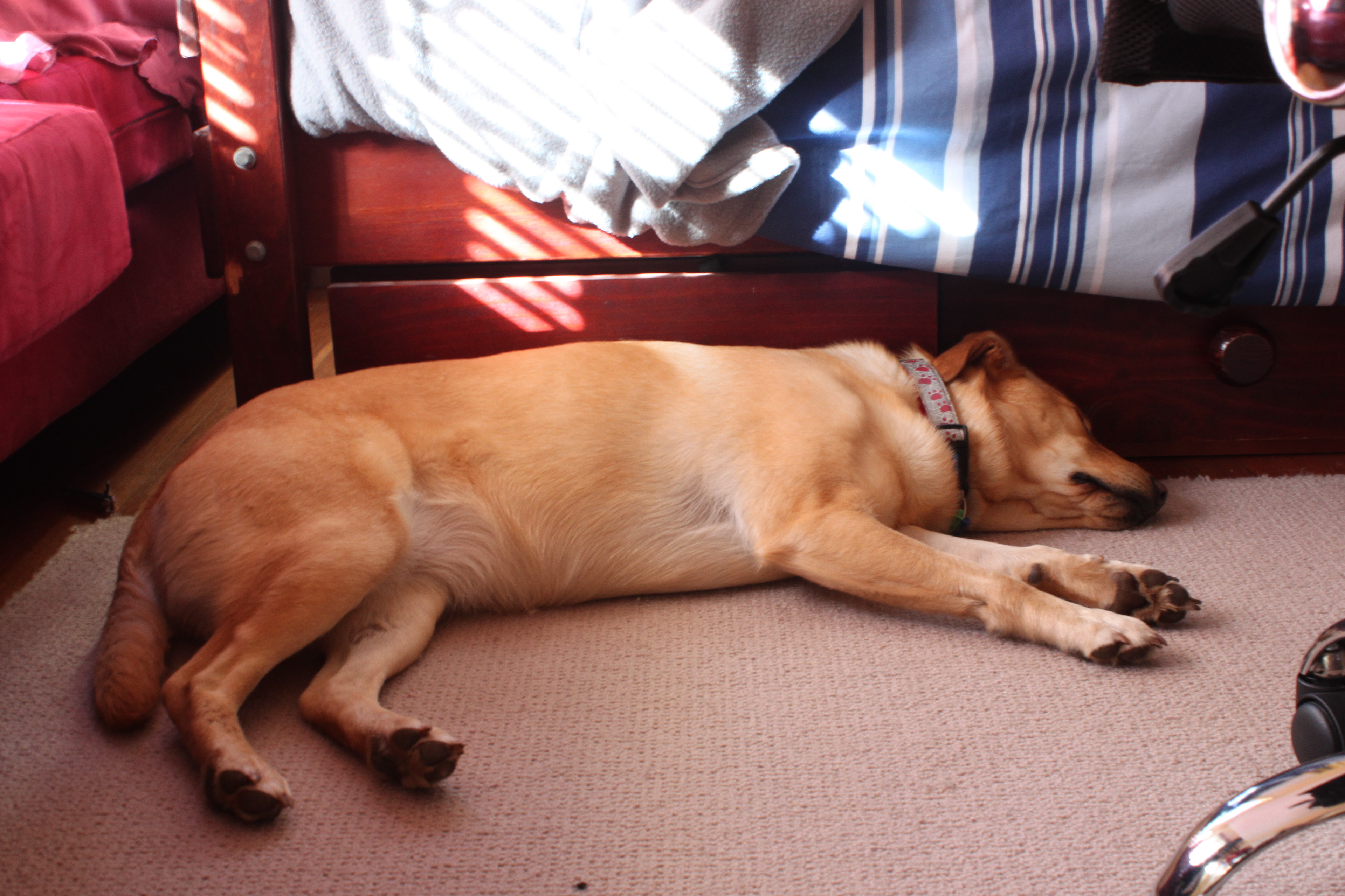
Day 58
Lazy Days
Lazy Days
Image of all things soft and cuddly using a balanced colour palette of warm reds, blues, yellows and browns.
Eveything about this image is about comfort and security. The dog is placed in a corner that seems to be an enclosed space (safety). The soft materials such as couch, bed and carpet and the sleeping dog evoke a relaxed and soft feeling. This composition has a strong context and mood.
Medium/media Used: Canon 500D
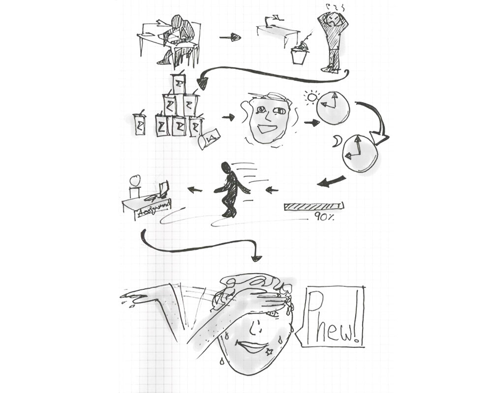
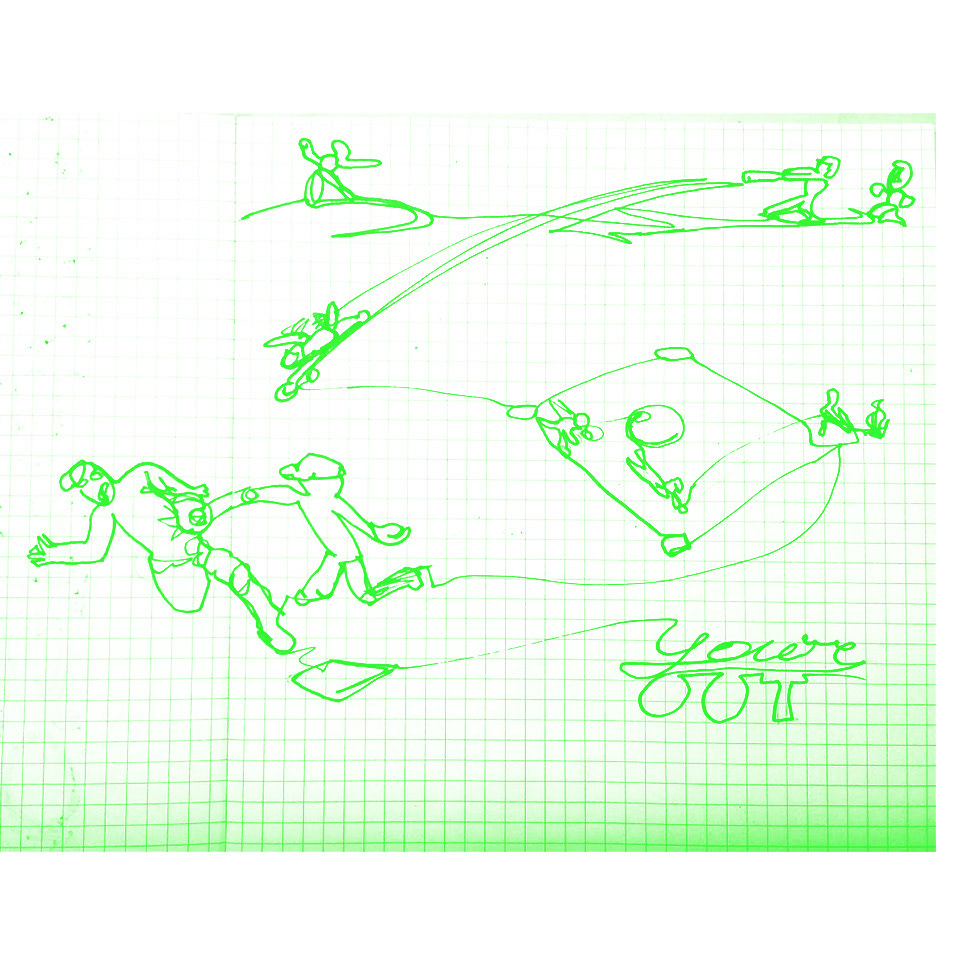
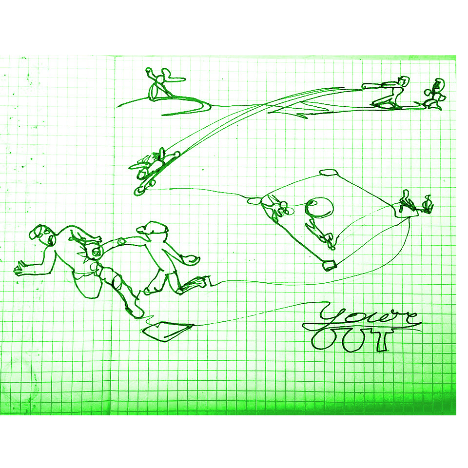
Day 59
Week 3 story telling task.
Last minute rush
Week 3 story telling task.
Last minute rush